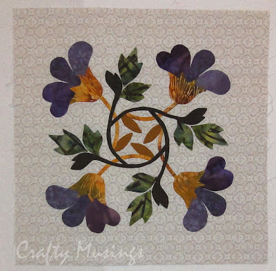
The colors were really distracting to my eye and made it hard for me to focus on design, so I switched my photo to greyscale to "see" it better.
At the beginning, Adrienne told us that her vision for this quilt was "Organized Chaos"-- she really wanted to focus primarily on the prints, using the solids as just accents. The subsequent borders by Anne and Kris did a beautiful job doing just that, so I really wanted to follow their lead by keeping to straight piecing, using as many of the included prints as possible while still having a sense of some sort of organization. I got the idea for flying geese from the center block. It didn't use flying geese, but the outside edges of the block had that kind of flavor. I ran with it.

My border ended up being less "organized" than Kris's (the next one in-- if you look closely, you can see how wonderfully deliberate her use of color is), but maybe a slightly more organized than Anne's (the gorgeous fractured border surrounding the center block). Like Anne, I used every print available. Like Kris, I used very regular shapes throughout. I also tried to echo the center block (and Kris's border) by repeating the solid elements.
Overthink much, Robin? :P
I felt so out of my element with this one, wrapping my brain around it was a serious challenge. It was fabulous.


