I've been hanging onto that desire to create and have made some good progress on my new project:
The four blocks on the bottom left are all sewn, and the three on the right are in progress. It is a twelve block quilt, so I feel as if I'm already more than halfway. Yay!
I'm really enjoying putting this one together so far. Rainbows are totally fun. :)
Monday, July 27, 2015
Monday, July 20, 2015
Starting fresh
My mom passed away this weekend. She had been struggling for a number of years, so in many ways, it was a blessing. But I can't help but feel sad and a bit bewildered. A world without my mom... it is a strange thing.
I find myself really feeling a need to make and create right now. So I have been taking some time in my quilt cave to figure out how to channel this energy. I found my project:
My plan is to use this pattern, from the May/June 2014 issue of McCall's Quilting but make it ROY G BIV style.
Last fall I purchased a beautifully curated color wheel-inspired set of fat quarters from Pile o' Fabric. So I used that as a base and have supplemented with some additional prints and solids. Just looking at the stack makes me happy. What's not to love about rainbows?
For the background, I'll be using a deep blue solid, Kona Nautical. I'm toying with the idea of mixing up the background a bit though as well. We'll see.
I find myself really feeling a need to make and create right now. So I have been taking some time in my quilt cave to figure out how to channel this energy. I found my project:
My plan is to use this pattern, from the May/June 2014 issue of McCall's Quilting but make it ROY G BIV style.
Last fall I purchased a beautifully curated color wheel-inspired set of fat quarters from Pile o' Fabric. So I used that as a base and have supplemented with some additional prints and solids. Just looking at the stack makes me happy. What's not to love about rainbows?
For the background, I'll be using a deep blue solid, Kona Nautical. I'm toying with the idea of mixing up the background a bit though as well. We'll see.
Sunday, June 21, 2015
Birthday gifts
We've celebrated a couple of birthdays lately-- meaning more Personalized Name Pillows pattern from Kimberbell Designs!
Flynn's favorite color is green:
I used a green dimple dot on the back. So soft!
Max's favorite color is white.
I couldn't bring myself to make a white pillow for a 5 year old, so I went with blue (a second favorite) and silver (which is kind of white-ish, right?).
I used a cool textured silver lame for the star accents.
The back has a silver-grey minkee stripe. Super cozy!
As ever, the pillows were fun to make and were received with great cheer. Truly, this pattern is fabulous!!!
Flynn's favorite color is green:
I used a green dimple dot on the back. So soft!
Max's favorite color is white.
I couldn't bring myself to make a white pillow for a 5 year old, so I went with blue (a second favorite) and silver (which is kind of white-ish, right?).
I used a cool textured silver lame for the star accents.
The back has a silver-grey minkee stripe. Super cozy!
As ever, the pillows were fun to make and were received with great cheer. Truly, this pattern is fabulous!!!
Saturday, June 20, 2015
Teacher gifts
The last day of school for Big Bear was on Thursday. I made a couple of gifts for his teacher.
First was a collaborative gift I put together from the class (heavily inspired by Pinterest, of course!).
Each student painted a 4" square of watercolor paper and signed the back of the square. I then used a Cricut machine to cut out the butterfly shapes from the painted squares as well as from colored tissue paper. I glued tissue paper butterflies to the back of each cutout both to cover the writing on the back as well as to give some more color. I then pasted the tissue paper cutouts onto the background (a 12" x 12" heavyweight scrapbook paper) to act as sort of "shadows" for the dimensional butterflies. The background paper turned out not to be heavy enough and was bowing/curling from the glue even before I added the dimensional butterflies. So I backed the whole thing with some thick paperboard cut to size which flattened everything back out. Then I scored each of the painted butterfly shapes on either side of the middle, carefully folded up the wings and antennae and used hot glue to position each atop a "shadow."
The quote was one I found online that I printed onto vellum and glued to the background. It was perfect as they spent the last 2 months studying butterflies as a part of their second grace curriculum.
I didn't have time or space (12" x 12" was a tight fit for all those butterflies!) to have the kiddos sign the actual piece. So before cutting, I photographed the names on the back of the squares. Then I used Paint Shop Pro to resize the names so they were proportionally the same size. I printed them out and then traced them onto the corner of the background.
I found a relatively inexpensive 12" x 12" shadowbox frame at Michaels to finish it off.
As papercrafting is not my thing, I'm pretty pleased with how this project turned out. And Big Bear's teacher was happily surprised and touched by the gift. Yay!
In addition to the class gift, I also decided to put together a little gift basket to the teacher from our family. I used Pink Penguin's happy little patchwork basket tutorial, but enlarged it a bit so that it finished at 5" x 7".
I used some linen for the body of the basket and a cute linen/cotton charm pack (purchased from Michelle Engel Bencsko's Cicada Studio way back in 2008) for the patchwork. I interfaced the linen before sewing to give it some stability and used fusible fleece for the inner lining. The lining fabric is quilting cotton from my stash.
The basket didn't go together entirely as expected. The thickness of the charm square fabric did not lend itself to finishing in the manner as called for in the pattern. So I improvised, resulting in the narrow border of lining along the top of the basket. It worked out okay, but it is not as tidy as I would have liked.
I didn't get a picture of it all filled with goodies, but they included a Starbucks tumbler (one of the fancy duo-chromatic ones that just lately came out), a Starbucks gift card, a gourmet chocolate bar, and a gift card to her favorite restaurant, along with a heartfelt thank you card.
Hopefully, she enjoys it!
First was a collaborative gift I put together from the class (heavily inspired by Pinterest, of course!).
Each student painted a 4" square of watercolor paper and signed the back of the square. I then used a Cricut machine to cut out the butterfly shapes from the painted squares as well as from colored tissue paper. I glued tissue paper butterflies to the back of each cutout both to cover the writing on the back as well as to give some more color. I then pasted the tissue paper cutouts onto the background (a 12" x 12" heavyweight scrapbook paper) to act as sort of "shadows" for the dimensional butterflies. The background paper turned out not to be heavy enough and was bowing/curling from the glue even before I added the dimensional butterflies. So I backed the whole thing with some thick paperboard cut to size which flattened everything back out. Then I scored each of the painted butterfly shapes on either side of the middle, carefully folded up the wings and antennae and used hot glue to position each atop a "shadow."
The quote was one I found online that I printed onto vellum and glued to the background. It was perfect as they spent the last 2 months studying butterflies as a part of their second grace curriculum.
I didn't have time or space (12" x 12" was a tight fit for all those butterflies!) to have the kiddos sign the actual piece. So before cutting, I photographed the names on the back of the squares. Then I used Paint Shop Pro to resize the names so they were proportionally the same size. I printed them out and then traced them onto the corner of the background.
I found a relatively inexpensive 12" x 12" shadowbox frame at Michaels to finish it off.
As papercrafting is not my thing, I'm pretty pleased with how this project turned out. And Big Bear's teacher was happily surprised and touched by the gift. Yay!
In addition to the class gift, I also decided to put together a little gift basket to the teacher from our family. I used Pink Penguin's happy little patchwork basket tutorial, but enlarged it a bit so that it finished at 5" x 7".
I used some linen for the body of the basket and a cute linen/cotton charm pack (purchased from Michelle Engel Bencsko's Cicada Studio way back in 2008) for the patchwork. I interfaced the linen before sewing to give it some stability and used fusible fleece for the inner lining. The lining fabric is quilting cotton from my stash.
The basket didn't go together entirely as expected. The thickness of the charm square fabric did not lend itself to finishing in the manner as called for in the pattern. So I improvised, resulting in the narrow border of lining along the top of the basket. It worked out okay, but it is not as tidy as I would have liked.
I didn't get a picture of it all filled with goodies, but they included a Starbucks tumbler (one of the fancy duo-chromatic ones that just lately came out), a Starbucks gift card, a gourmet chocolate bar, and a gift card to her favorite restaurant, along with a heartfelt thank you card.
Hopefully, she enjoys it!
Sunday, May 24, 2015
It doesn't always work.
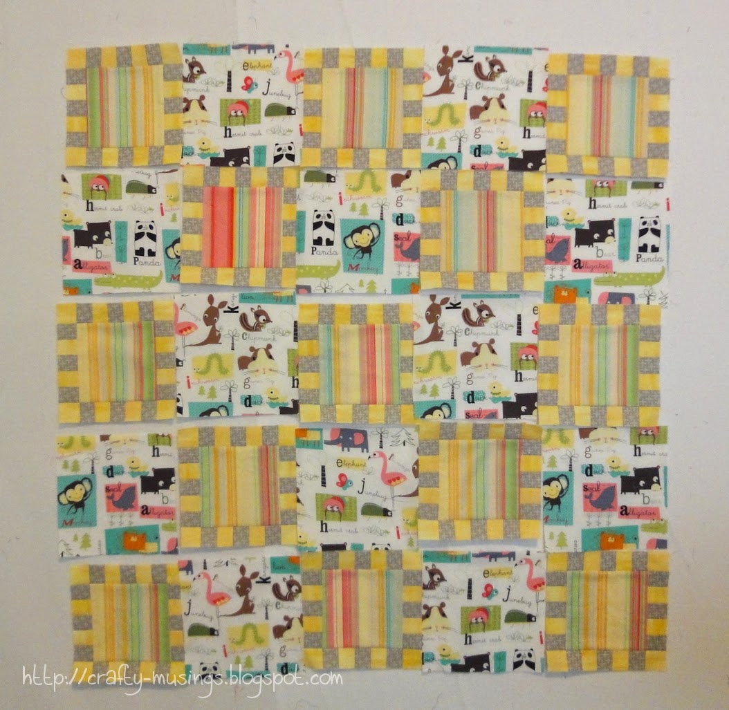
I like to think that I'm pretty good at putting colors/fabrics together. But not everything works the way I think it will. Case in point:
On a whim, I started pulling fabrics from my stash. The colors all worked together. But in this configuration? Not so much. Washed-out weirdness (in person, it is even worse).
Feeling lazy, rather than fixing the "real" problem of the grey/yellow pieced blocks, I decided to try and make them work by finding a new focus fabric.
Still not perfect, but soooo much better with some contrast in there. I think with some borders, this one is going to be okay. And at this point, okay is feeling pretty good to me.
On a whim, I started pulling fabrics from my stash. The colors all worked together. But in this configuration? Not so much. Washed-out weirdness (in person, it is even worse).
Feeling lazy, rather than fixing the "real" problem of the grey/yellow pieced blocks, I decided to try and make them work by finding a new focus fabric.
Still not perfect, but soooo much better with some contrast in there. I think with some borders, this one is going to be okay. And at this point, okay is feeling pretty good to me.
Tuesday, May 19, 2015
Sunrise Coins - Blogger's Quilt Festival, Spring 2015!
It's Bloggers' Quilt Festival time again! I'm excited that I have something new to share for this one...
Every so often, I am compelled to make a quilt "just because." No recipient in mind, no real need, but just because I really want to make it. Such is the case with this fun design by Julie Herman of Jaybird Quilts:
It is called "Framed Coins" and can be found in the (incredibly awesome) book, Skip the Borders. This is actually the third project I have completed from the book. I am a fan.
Can't say as I was horribly original with this one. I pretty much did the exact same thing as in the book, just with red/oranges instead of greens (thus I've given it the name "Sunrise Coins"). But-- it was all from my stash! Woo!
It measures 72" x 72" so I have entered it in the ,"Large Quilts" category.
I had fun with the quilting though! Aurfil Mako 50/2 thread was used throughout. I started by stitching in the ditch around the colored frames and each group of coins (2370, "Taupe"). Then inside the coin sections, I used a grey thread (2600, "Dove") and did a flame-y all-over type thing (inspired by the "Allover Leaves" design found in the book, Free-Motion Quilting with Angela Walters-- another awesome book!). Then for the colored areas, I used contrasting thread and free-motioned the straight(ish)-line frames. In the red, I used orange (2150, "Golden Poppy"). In the orange, I used red (2250, "Red"). In the peach I used coral (2255, "Dark Texas Orange"). In the coral, I used peach (2220, "Salmon"). I was really pleased with how it all came together!
The back is a fabric I've had in my stash since about 2000. It is such a beautiful print and it just seems to work so well with this quilt. I am also proud of having tried something new with the binding on this one. Most of the binding is black and white polka-dot. But there are two sections where I changed colors of binding to match the adjacent blocks. It was fun trying something new, and I think it looks pretty snazzy too.
It almost feels kind of cheater to call this one a 2015 finish as all but the binding was done last July (and I was too lazy to re-do the label). But the last stitches didn't go in until this year, so 2015 it is!
Thanks so much for stopping by and checking out my quilt. Have fun enjoying all of the other fabulous entries!
Thursday, May 7, 2015
Ina Maxi goodness!
My latest finish:
This is the Ina Maxi Skirt, a PatternReview.com exclusive pattern.
I purchased this happy coral stripe cotton knit from Gorgeous Fabrics with this pattern in mind. Based on my measurements, I cut a size Large, which worked for some parts and was big in others. In the photos above and below, I've tucked in my shirt to try and give an idea of how un-fitted the waist is on me).
While I like how it fits and skims my body from my hips downward, I definitely need to go down a size (or more) for the waist. I tried to mitigate by doing some shaping-- I cut 7/8" from the top of the waist side seams tapering down to the original waistband seam at the bottom. That helped some, but it is still pretty loose where I want it to be close-fitting (because I want it to feel like its gonna stay on/up!). The fabric is 100% cotton and seems to have good recovery-- but maybe something with lycra would help with fit as well?
The only other alteration I made was to trim off 1/2" from the hem. It is still on the long-ish side, though its totally wearable so long as I wear a bit of a heel. Next time, I'll probably shorten it by 1 to 1-1/2" above the tulip part. I also made sure to insert a ribbon to mark the back, which is only subtly different from the front (you can see it poking out in the right pic of the above collage).
On the bright side, I have worn the skirt twice now without incident-- the skirt totally stayed in place and there was no unnecessary flashing. And it is so cute! I love the look of this skirt. I can see myself having another one in my closet at some point-- with a wider, multi-colored stripe print, or even with a pretty solid.
And I feel so fancy when I wear it!
This is the Ina Maxi Skirt, a PatternReview.com exclusive pattern.
I purchased this happy coral stripe cotton knit from Gorgeous Fabrics with this pattern in mind. Based on my measurements, I cut a size Large, which worked for some parts and was big in others. In the photos above and below, I've tucked in my shirt to try and give an idea of how un-fitted the waist is on me).
While I like how it fits and skims my body from my hips downward, I definitely need to go down a size (or more) for the waist. I tried to mitigate by doing some shaping-- I cut 7/8" from the top of the waist side seams tapering down to the original waistband seam at the bottom. That helped some, but it is still pretty loose where I want it to be close-fitting (because I want it to feel like its gonna stay on/up!). The fabric is 100% cotton and seems to have good recovery-- but maybe something with lycra would help with fit as well?
The only other alteration I made was to trim off 1/2" from the hem. It is still on the long-ish side, though its totally wearable so long as I wear a bit of a heel. Next time, I'll probably shorten it by 1 to 1-1/2" above the tulip part. I also made sure to insert a ribbon to mark the back, which is only subtly different from the front (you can see it poking out in the right pic of the above collage).
On the bright side, I have worn the skirt twice now without incident-- the skirt totally stayed in place and there was no unnecessary flashing. And it is so cute! I love the look of this skirt. I can see myself having another one in my closet at some point-- with a wider, multi-colored stripe print, or even with a pretty solid.
And I feel so fancy when I wear it!
Subscribe to:
Posts (Atom)