One of the things I enjoy as I read blogs is learning a little about the process behind a project-- be it fabric decisions, block placement, or design choices. Since I found myself having to make a decision in the design of my wedding quilt, I thought it might be fun to share a little of my process.
At issue: I needed a corner block for the outside border of my wedding quilt. And I knew I wanted more than just a plain square.
In my original design, I had decided on this block, with these fabrics:
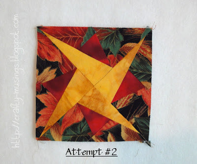
I really like the look of the style of block-- it has movement and is a happy starry shape. But it just looks too muddy with the red print on the busy leafy background print. I tried it again:
I used a red batik instead of the red print in the smaller star points. This one is better, but it still doesn't feel like the star stands out enough. It's a detailed design, and I want all that work to really sparkle! So for the third attempt I decided to try out a different background to see how that worked:
The star is shining for sure now! The dark brown batik really allows the yellow and red to pop. Then I looked at it in the quilt:
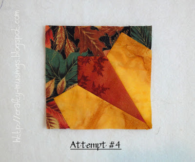
Hmmm... I'm not diggin' this. The dark brown is just too stark when surrounded by all the leafy print. And now that the star is really visible, it just doesn't seem to fit. It feels a little too stark, angular, and "off" in relation to the rest of the quilt. I went back to the drawing board and came up with this:
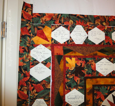
I definitely wanted to move in a more simple direction (no more foundation piecing!). I have also been loving Dresden plates/fans lately, so maybe that is why this block called to me. But it also isn't completely different from the original design. It includes the same fabrics (yellow batik, red print, leafy background), but because the fabric pieces are bigger, I don't get the same sense of muddiness. This block also includes points, but they are in a different style than the ones in the original. I slapped it up onto the wall to check it out:
It doesn't have the same movement as the previous iterations; rather, it has a symmetry that I find very appealing in the context of the quilt. It kind of echoes the compass points in the center, but with a different look. I'm feeling good about this one. I declare this block the winner!
It can be very frustrating when I find myself having to rethink a design. But sometimes, a little bit of trial and error is what is needed to get me on a better path. That doesn't mean I like it though. Trial and error kind of sucks-- so much wasted effort. On one level, I realize it is not actually wasted because it does get me where I need to go and one of the challenges of design is that it really can be a process; but even with that understanding, on another level, it still feels wasted (and there's a bit of bitterness in there too). It occurs to me that maybe this frustration is part of why this project sat languishing in the closet for the last 10 years. Maybe I needed a break, some fresh perspective, to be able to come to terms with the mistakes and be able to make some changes? I can't even remember. But at least I'm making progress now!
Thursday, October 18, 2012
Subscribe to:
Post Comments (Atom)


Good choice! This one is defiantly fitting. You were right about the first one being muddy; I did not even realize the red print was in there at first.
ReplyDeleteI like that last block the best two.
ReplyDeleteFun to watch your progress of the mystery quilt.
Cute photo of the boys.